
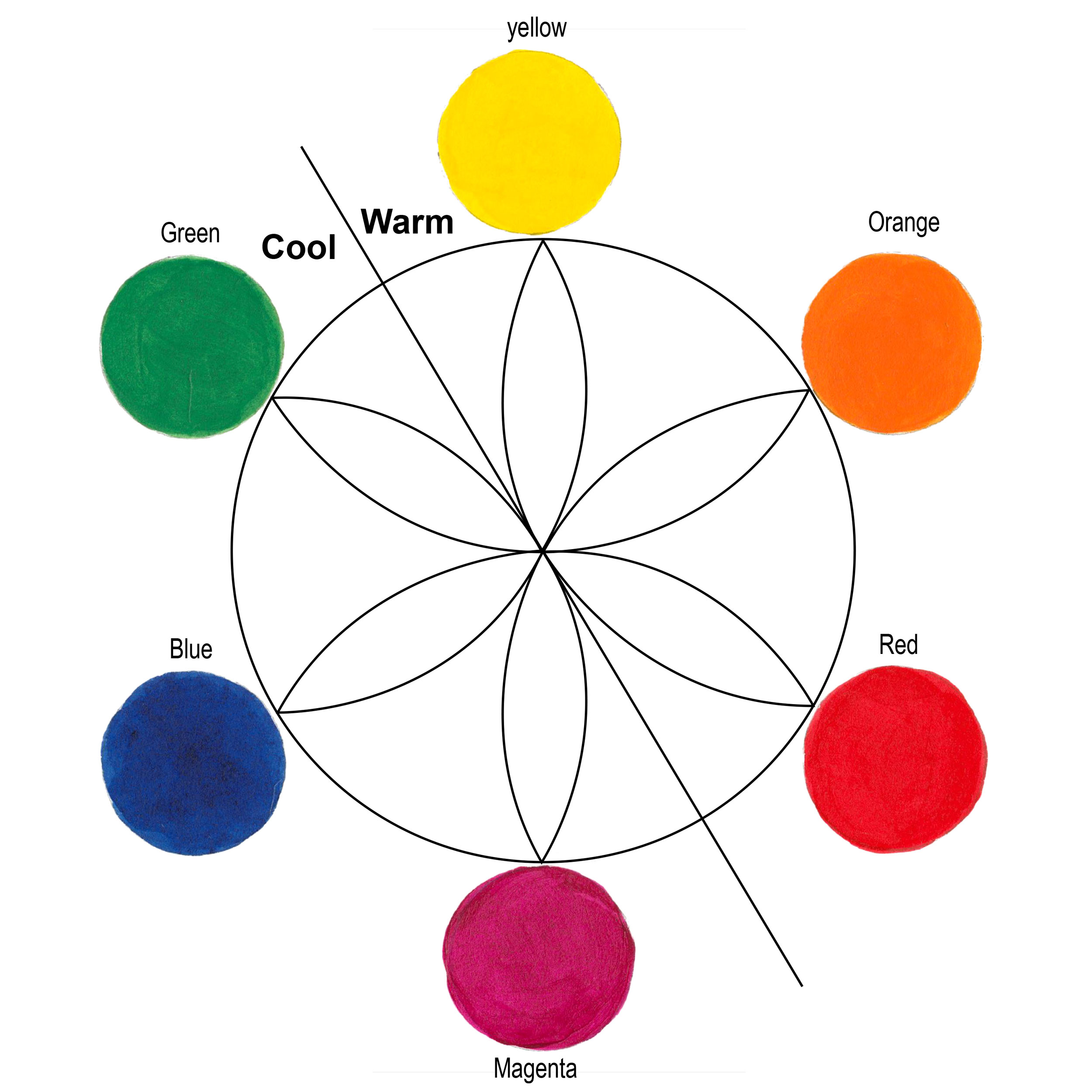
The concept of warm and cool colors has been written about for hundreds of years. Most theories start with the classic six point color wheel (three primary colors and three secondary colors). A dividing line splits the wheel into warm and cool. The line location varies based upon the reasoning of the theorist. Regardless, the general idea is the warm colors are Red, Orange and Yellow; and the cool colors are Green, Blue and Magenta (Figure 2).
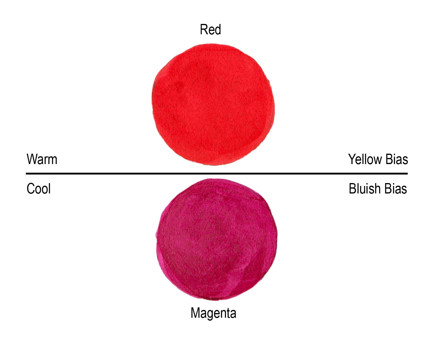
Compare “yellow” to “blue” and it’s easy to see yellow is warm and blue is cool. Comparing “red” to “magenta” might be less obvious since they are next to each other. But if you identify and compare the “color temperatures”, a bluish red (magenta) is cooler than a yellowish red (Figure 3). Describing how a color leans towards another primary or secondary is also referred to as its“bias.” A red, as we can see, can have a yellow or a blue bias.
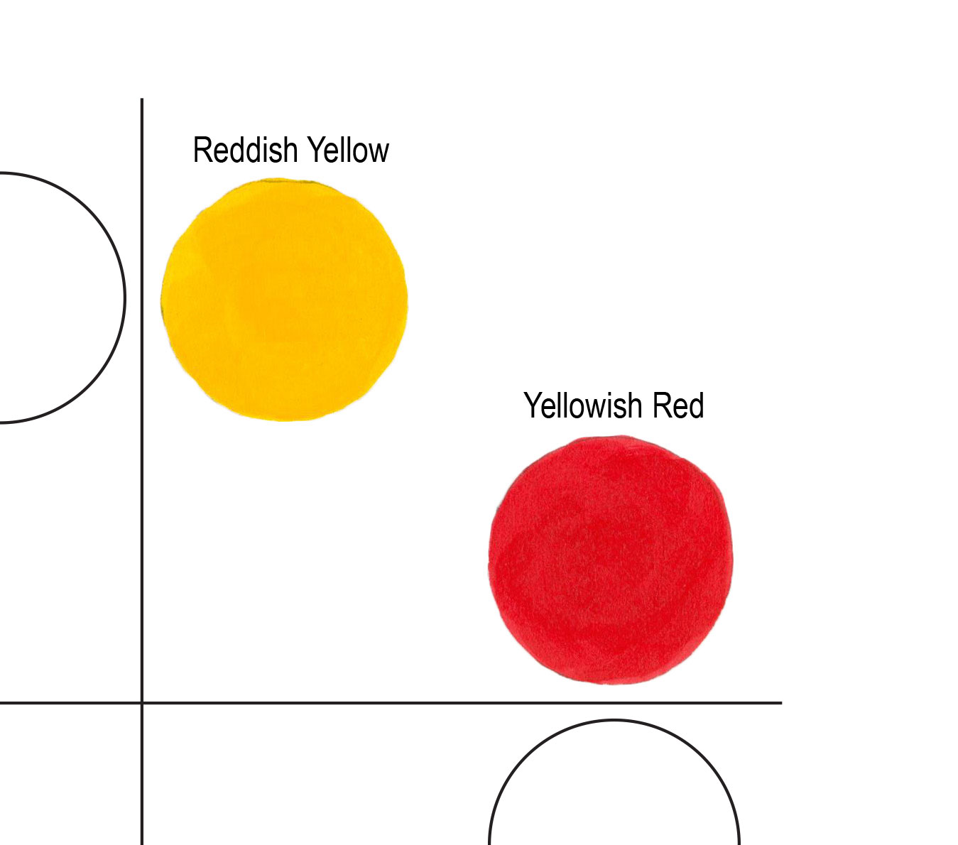
Color temperature is also important during paint mixing. In order to make clean mixtures use colors with similar color qualities. For example, mixing a yellowish red with reddish yellow yields bright secondary oranges (Figure 4). In describing a color to someone, we often refer to color “bias”. A red can have a yellow bias or it can have a blue bias.
To identify color temperature you’ll need to learn how to see and identify warm and cool colors. Some colors are easy to discern, but looking at our 108 colors in our Heavy Body Acrylics line, “color temperature” gets tricky. In the world of paint colors, there are warm AND cool greens, blues, red, yellows, earth colors, blacks and whites. Comparing a warm red to a cool red and then compare those to a third color, you should be able to see if it’s yellower, bluer, or in between the first two reds. Once you begin to “see” the differences it becomes easy to identify any color.
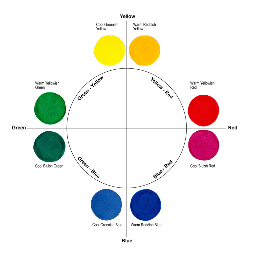
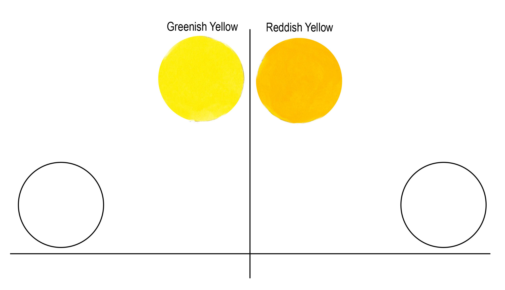
To make this as easy as possible, stretch out the color wheel to eight primary colors (Figure 1). The colors are on a grid. Yellow is at the top, with the left example being a cool yellow because it has a green bias, thus we describe this as a “Greenish Yellow”. The yellow to the right is a “Reddish Yellow” and identifies as a warm yellow (Figure 5).
Clockwise, we move toward reds. The top red is a “Yellowish Red” because it has a yellow bias. Not by accident, the Yellowish Red is in the same quadrant as the Reddish Yellow. Mixed together the resulting orange is “clean” (Figure 4). Clean color refers to having no biasness resulting in a duller or “muddy” color.
The lower red has a blue bias. Having the two reds next to each other makes it easier to identify the color temperature. Our “Bluish Red” mixes very cleanly with our “Reddish Blue” at the bottom right, resulting in vibrant purples and violets. Mixing the Yellowish Red with the Reddish Blue would make a dull maroon (Figure 6).
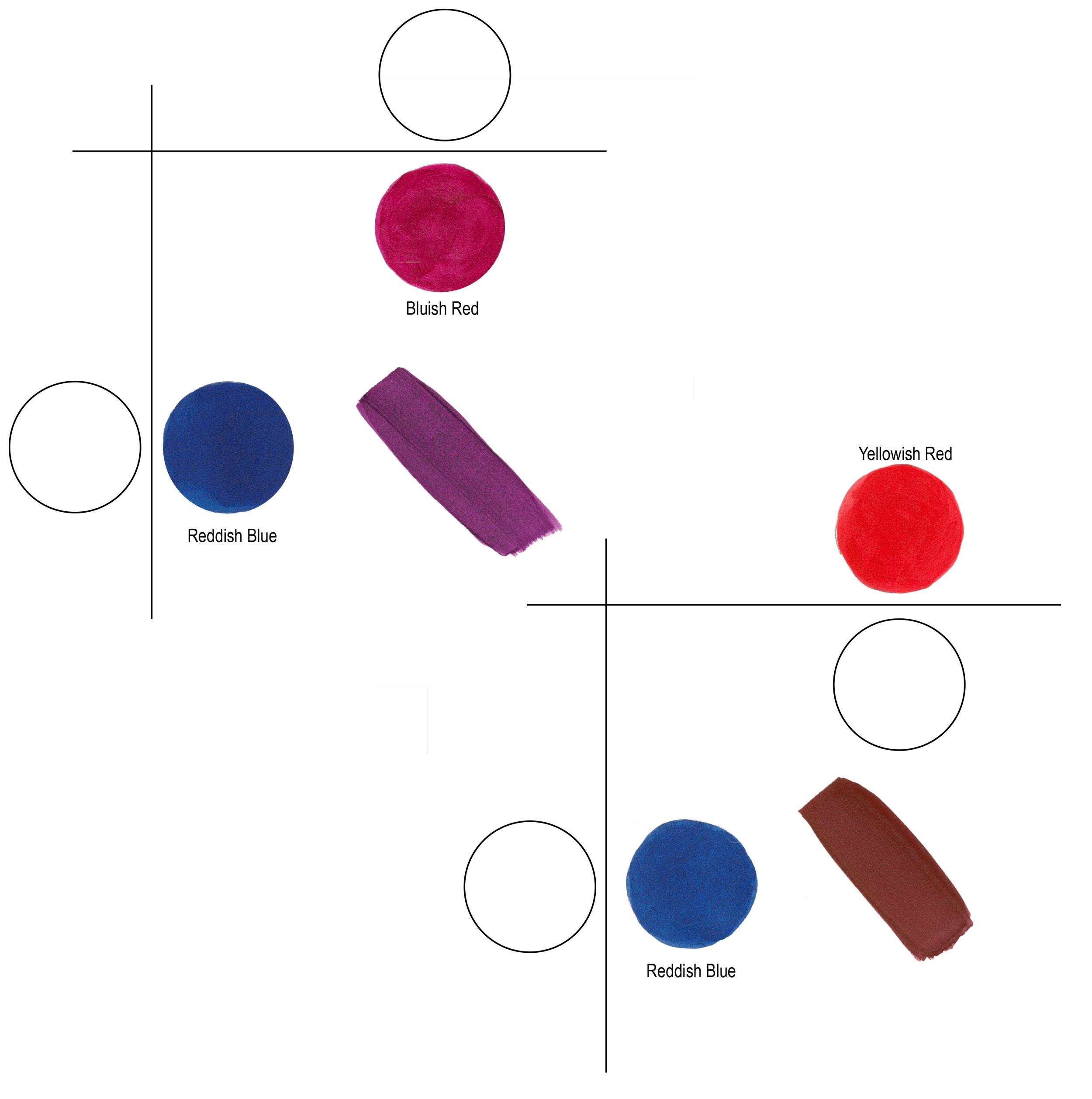
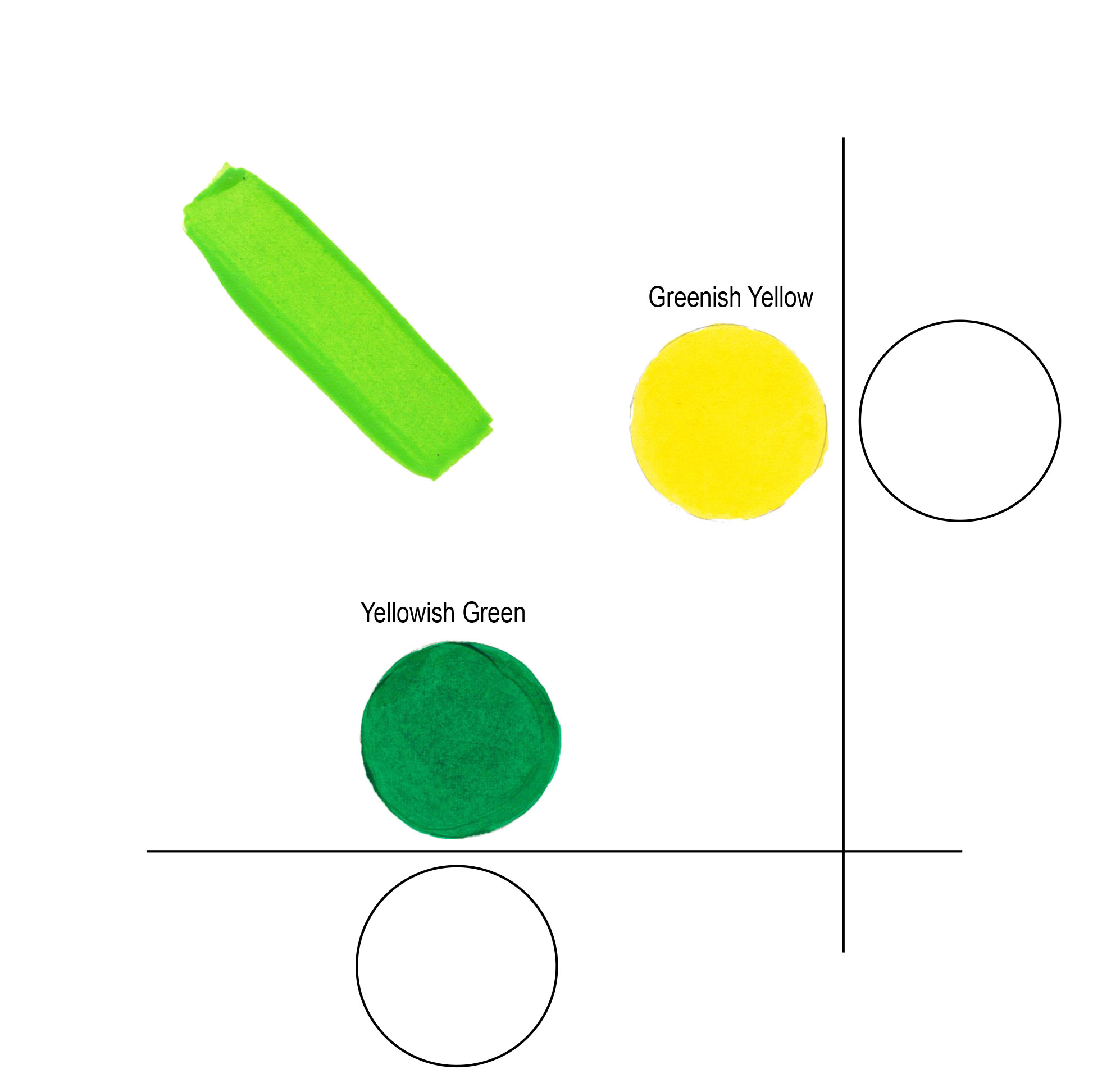
Each quadrant lines up similarly. The “Greenish Blue” or cool blue mixes cleanly with the cool “Bluish Green”. The “Yellowish Green” is warm and creates vibrant bright greens when mixed with its quadrant companion “Greenish Yellow” (Figure 7).
Color temperature doesn’t line up neatly when mixing colors. By chance the warm Reddish Yellow and warm Yellowish Red work together, but the warm Yellowish Green mixes best with the cool Greenish Yellow. What’s more important is that you can identify the color temperature and its dominant bias so you can choose the best mixing color based on your needs and paint colors you have on hand.
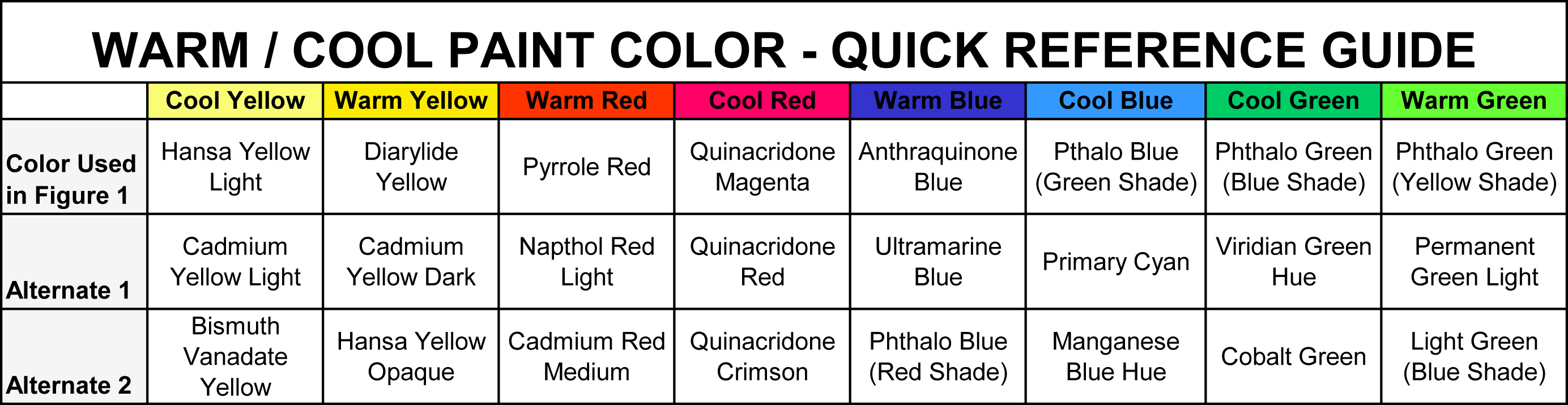
Below is a table that identifies the colors used to create this chart and additional examples of similar temperature colors (Table 1).
For a full listing of the GOLDEN Heavy Body Colors, arranged from Cool to Warm by color families, please see the following PDF:
Cool to Warm Listing for GOLDEN Heavy Body Acrylics

Subscribe
Subscribe to the newsletter today!
That was well done! I didn’t know all that.
Thank you Lisa!
– Mike
Ok, I understand warm and cool colors. Now, how do I apply this knowledge when choosing colors going next to each other. For example pink tulips, what color green do I pick. Warm or cold?
Thank you.
Cheryl A.
Hello Cheri,
Thank you for your questions! If your pink tulips are made using Quin Magenta or Quin Red, then you have a cool color. If you want to the green to be in front of or at least at the same distance (as you would with the stem and leaves, I’d use a warm yellowish green. If you want the green to be the background color, then a cool bluish green would help push the flowers forward. Juxtaposed colors are a wonderful area of color theory to study and practice.
– Mike
Hi Michael, yes right, from what I know cool colours recede.
Thanks for commenting, Warren.
– Mike Townsend
just stumbled acrosss this….5 years later…….in my experience in choosing warm or cool…..what do i want coming forward and what do i want go backward….with your tulips….what do i want that green to do………
paint the pain away,
r
It is a good idea that you made that pdf file containing list of warm/cool golden colors. Could you do the same for Williamsburg oils (with italian and french eraths included)?
Hello Ivan,
Thank you for your questions. I believe we are planning to provide the warm and cool designations for Williamsburg Oils and QoR Modern Watercolors in the near future. I’ll add them in below the GOLDEN listings when they become available.
– Mike
Hello – Interesting article and just to add a note: Newton’s primaries were blue and yellow.
Hello Martha,
Thank you for your comments. According to “Color Systems in Light and Science” (Stromer, 1999), Sir Isaac Newton listed 7 primary colors in concert with the 7 sound intervals within an Octave of the Dorian Music Scale. He converted this from line into the familiar circle of which he is credited as the first to draw in 1678.
– Mike
Yes, Martha may be thinking of Robert Hooke or Christiaan Huygens here.
Or Von Goethe..
– Mike
i love these articles. thank you so very much for excellent resources.
You are most welcome Janet!
– Mike
do you have a print available to order of the pfd?
Hello Selena,
If you click on the link for the complete warm/cool color list it should automatically download the PDF onto your device. We can also email a copy of the PDF to you if you like. email [email protected]
-Mike
I find my printer does not do a good job on color. Your product posters are my studio “wallpaper”.
I have the same problem with my printer.
Interesting read…very helpful. Do you tubes of paint happen to indicate whether it is a warm or cool colour? That would be helpful when buying colours. If not, can you make that suggestioin to the company. We don’t always have our colour wheels with us at the art store. Thanks, Cathy
Thank you for your comments Cathy. I’ll be happy to pass your suggestion along to Marketing!
– Mike
Great to see the four-primary (opponent hue) colour wheel being used here, it’s very intuitive for students, but imagine your diagram with every “warm” and “cool” reference removed. Wouldn’t it be perfectly clear and logical without them? I don’t know if you realize what a battleground you’ve waded into here over “warm” and “cool” blues, but you might like to read this: http://www.huevaluechroma.com/077.php
Thanks David. I appreciate the feedback. Warm and Cool are terms we wanted to clarify simply, but it is hard to not get into this subject without identifying bias. I prefer to use bias rather than warm and cool to reduce confusion. Great link to the “battle”!
– Mike
hi michael,
i new artist and am trying to get into my head warm and cool colors, your article explained simply, please dont confuse me with bias whatever that is.
thankyou
kathy c
Hello Kathy,
Thank you for your comments. We tried to keep the technical jargon to a minimum for this article.
The term “bias” refers to the direction a color leans. As the article describes, a red paint – unless perfectly balanced – will have either a yellow or blue bias. I like to use the phrase “yellowish” or “bluish” to describe a specific red paint which is in reference to the color bias. Overall, the terms you prefer to use: warm or cool color, yellowish or bluish color, yellow-bias red or blue-bias red, as long as you are able to make sense of it and most importantly be able to use that information to aid in painting is what it’s all about!
– Mike Townsend
I love just print! For articles just like this!! I haven’t seen my just print in the mailbox for over a year now… yet I sign up for it every time y’all Facebook an article from it…sigh:
Hi Marty,
Thank you for the positive feedback about the article and Just Paint. We moved to one printed copy a year but have committed to creating content every month for the online version at JustPaint.Org If you send an email to [email protected] with your physical mailing address we can make sure you are signed up for the next printed issue!
– Mike
Sorry Marty if we haven’t replied to you earlier. Just Paint in the Print version is now being produced once a year. Our JustPaint articles now appear much timelier online and we have committed to try to update our work much quicker with two articles per month. The Print version will be an even more exhaustive piece than it had been in the past allowing for lengthier discussions of topics that we believe merit greater coverage.
Any updates regarding the war/cool colors in the Williamsburg oil paints line?
Hi Steve,
None so far, but it is on the project list!
– Mike Townsend
I think for many beginning/hobby painters, these issues are often treated in academic terms rather than practical. That seems often to be the reason for confusion. This is similar to the relationship between pigments and colours. Trying to explain how or why the same pigment has a different dried appearance between different manufacturers can be daubting. That is before you consider the various common names for the same pigment!
Enjoyed your explanation and discussion very much, and the .pdf showing the warm/cool relationship of your various acrylic colours is most welcome!
Thank you, Charles. I appreciate the feedback!
– Mike Townsend
The Blue that is between a cool red and a cool blue cannot be warm. Ultramarine Blue is not warm.
Hello, Bitsy.
Thank you for your comments. I believe that it is all relative and based upon what approach you prefer to work with. A blue with a reddish cast to it reads warm, when compared to a greenish blue.
One of our favorite color sites, Handprint.com, states this very well.
– Mike Townsend
Please see that the easy reference guide for warm and cool has the blues heading reading anthraquinone, ultramarine and phthalo blue red as WARM when they are actually cool. Likewise the WARMS should be heading for phthalo gree, primary cyan, manganese blue hue.
Thanks
Thank you! Finally somebody who recognizes that the “warm/cool” notion is relative and does not occur right smack in the middle of the colour wheel. I’ve never been in agreement with those sources that slap a declarative warm/cool dividing line between yellow-to-red and magenta-to-green, and thought I must be missing something since hey, those people are experts writing books on art. Often on the very images they use to illustrate that “fact”, my eyes tell me that one of the colours used on the “cool” side is actually warm. I’ve also often had trouble with the colours some experts assign as primary; it always seemed to me that the bias of each mattered rather a lot. I work in polymer clay and have made countless colour chip samples mixing variously biased colours to work this out for myself. This article gives me the words for my intuitive impressions, and has wiped the fog of confusion away.
I like your phrasing of “bias”, and will adopt it from now on; it expresses well how I feel about the differences. A bit of a *duh* moment, but I am glad I turn out not to be full of it. 😉 Once again, thank you.
Alix.
Thank you for your kind words. I too was confused about all of this, and I don’t believe there has to be so much confusion about color bias. Every time we create new color chart arrangements we play the exercise of comparing each color against every other color in our paint lines. The best advice I can add is to get a hand-painted color chart, cut it up into individual squares, mix them all up and re-arrange them onto a sheet of illustration board. Some are easy and some are near impossible, but it trains your eye to really look at them for inherent properties.
– Mike
Bravo! Your articles are so helpful. Thank you.
Thank you, Michael. I have just begun my journey as a painter and am grateful to you. Your explanation clarified it for me perfectly: a color’s ability to appear warmer or cooler just depends upon what color it lies next to! Ba da bing! Thank you!!!
You also said that to get “clean” colors, mix warm colors with other warms, cool colors with other cools. To get muddy colors, mix warms with cools. Ba da bing! Thank You!!!
Michael, I would love to see an illustration of three color examples side by side: a warmer color, a cooler version of the same color, and the “pure” version of the same color (I believe the term for this is the “hue?”). I am guessing that a hue would contain equal amounts of warmth/cool. Is that correct? Would such a comparison be of value to us?
Thank you!
Thank you for your comments and questions Judith.
Hue refers to color, as in Chroma, Value and Hue. Chroma is how clean the color is, Value is how light or dark the color is, and Hue is the color space. For your color image request, we’ll have to work on that. We would need to use the computer to tell us what base color such as red sits directly on the line between warm and cool (neither a blueish red, or a yellowish red but squarely in between). Then we could identify either side of it, far enough away to be recognizable by the eye.
– Mike Townsend
I think it should not be explained on paint colors.
Color warmness is subjective feel, so I think we should try to define it on something closer to the brain, for example cones in our eyes… 😉
I was wondering about this question, and I think everything may be just in blue cons – If there is some blue light, it’s cool color. If there’s not, it’s warm.
…that’s what I think on the base of my personal feeling 😉
Krystus.
Thank you for your input. It is appreciated!
– Mike Townsend
I did experiments in advancing (warm) and receding (cool) colours using theatre gels and light. You can read the results at https://patrickgoff.com/art-2/learning-the-visual-language/
Thank you for sharing such helpful and needed information. I am a beginer, with a life long desire to create beautiful works. I never understood why mixing some colors produced dull muddy colors. I am about to pull out my paints and experiment with the information you have provided. Right now I only have craft acrylics, however, God willing soon I will begin purchasing a tube at a time of better quality acrylic paint. I CAN HARDLY WAIT TO PAINT WITH GOLDEN.
I look forward to reading and learning more from your posts. Thank you.
You are most welcome for the information, Monica.
Many artists will start with less expensive paints and increase quality as they are able to. This goes for paints, gessoes, mediums and painting surfaces. Less expensive, clean colors are going to help out and these can be “stretched” out with the use of mediums such as Glazing Liquid, Gloss Medium, and Soft Gel. I would suggest colors like Napthol Red Light, which is less expensive than Pyrrole Red but will yield similar mixing results. Chromium Oxide Green is a great yellowish Green that is often overlooked compared to Phthalo Greens, although the phthalos are very highly pigmented and can be extended with mediums quite a bit before they become too transparent. Try 10:1 medium to paint (Yes! That much!) to see how the paints behave and also what the medium does to the paint in terms of feel and look upon drying. Contact us at [email protected] if you have any other questions!
– Mike Townsend
THANK YOU, GREAT INFORMATION,
I’m recently retired and new to painting, I find my teachers (tried 3) only teach art, that’s like teaching creative writing to someone who doesn’t know the ABC’s. This is the first article that explained WHY a color is warm or cool.
I would like to know it you only mix warm colors and/or cool colors together, or if you mix one warm and one cool, you will get a neutral?
Also, is there a FULL list of colors listing which colors are warm/cool AND which colors are transparent, translucent or opaque.
I have trouble mixing color to get what I need, each teacher used a limited pallet (and different colors), but that doesn’t work for a beginner, until I get more experience I would like to purchase more colors. I think if I had better guidelines I could learn to mix and use color more effectively.
I hope you have other articles which explain the basics, I look forward to more articles.
Thank you
You are most welcome for this information.
I tried to write this in a way that took the mysteriousness out of the concept of warm and cool colors and also make the concept useful in the studio.
Color bias goes beyond the 4 color primary set introduced in the article. For example, there are warm browns and cool browns. Warm browns can be yellowish to reddish, and cool ones tend to be towards the greenish bias. Once you train your eyes to see these differences you can identify what other colors can be blended in and what the outcome “should” be.
I do not believe we have a complete color listing for all of our colors. We may need to create one if it seems helpful. As an artist, it cannot be stated enough that color mixing needs to be done by hand and with good note-taking to assure you can reproduce the mixtures during painting. A decent sketchbook is great to dedicate as your color journal. Start with the colors you already possess, and see if you can identify them as warm or cool but remember it is relative so you may need to state “…cool, compared to…”.
A color can be warm AND cool. If you have a cool red, such as Quinacridone Red, it is cooler than Naphthol Red Light but warmer than Phthalo Blue Red Shade. This is important so that you can better align the color palette you have, and likely doing this will identify gaps to fill with new colors.
I hope that helps out and always feel welcome to reach out to our group of Material and Application Specialists here at Golden. We’re here to help!
-Mike Townsend
It’s good to know this. Thanks for the article.
This is a very nice explainer on color temperature. I have been painting with a six color palette plus white for probably 20 years. Warm and cool yellow, warm and cool blue, and warm and cool red. When I was taking painting classes I took a color theory course, plein air landscape course, and abstract course all in the same semester. At that point, I knew I could mix almost any color with that palette.
Noting people wanting the chart but not getting great colour on their printers. Could you supply some handouts to stores that stock Golden?
Hi Heather.
Thank you for your question and suggestion! We would be happy to do a color printing of this article and send it to you if you would like. All we need is a postal address. You can request through this comment section and I’ll keep the address private (not publish it).
– Mike Townsend
Thanks for this very informative article. I am currently building my artist website portfolio and hoping to be able to sell to as wide a market as possible so this is helpful info. I subscribed to your newsletter and look forward to more art news, thanks!
Thank you for such a comprehensive, clear, well written and beautifully illustrated article on the use cool colors.
Hi Mike and the fabulous Goldens. Marion here. I still use Golden and WIlliamsburg products all the time of course!
I have now found a new usage for JustPaint as I am teaching a color and light class. I had not heard the “bias” explanation before and it is absolutely perfect and easy to teach and for students to consume. So thank you for that. I am forwarding my students your article here to introduce concepts of warm and cool – altho unfortunately the school only supplies them with gauche so I am not able to have them try this out with your colors yet! But in the future.
Loved your Golden Mural Paint btw also that I was able to use on a 7,000 square foot mural in Philadelphia last year through Mural Arts.
Cheers and thank you!
Marion Wilson
Hello Marion!
So great to hear from you! Warm and Cool is universal, so this works with any type of paint or colorant. A cool yellow is greenish compared to a warm yellow that is reddish. Paint names do not matter!
Let us know if you have any other questions!
Regards,
Mike Townsend
great work of explanation. the intricate of colour is so enormous and always confusing. However, you have also left it hanging. conclusively though relative and subjective how would cool and warm colours be explained or defined?
Hello, Brian.
Thank you for your comments on my article. Overall, the temperature of a given color could be provided using L*a*b* Spectrometer data, where you can note the bias of a color. However, how practical would this information be as an artist? The noticeable colors will create enough bias when mixed with another color compared to those colors that can only be discerned with software.
– MIke Townsend
I was considering painting my bedroom red, but then I read on another article that ruby red is a cool jewel tone https://www.bedroomideaslog.com/jewel-tones/. Here, I am finding out that red is a warm color. Is ruby red really cool or warm? Do you have a clue?
Hello, Jack.
“Ruby red” would be considered a cool tone as it has a blue bias. Quin Red would be a good example of a ruby red. Here’s a range as an image below:

– Mike
Hi Mike – thank you for putting all this info together and sharing it with us. I don’t understand something and was hoping you could explain it to me: In this last section I’m confused by what you’re trying to say:
“Color temperature doesn’t line up neatly when mixing colors. By chance the warm Reddish Yellow and warm Yellowish Red work together, but the warm Yellowish Green mixes best with the cool Greenish Yellow. ”
It seems like what you’ve been saying all along, I don’t understand the “but the warm Yellowish Green mixes best with the cool Greenish Yellow.
Thanks for you help here.
Hello Doug. Thank you for your questions.
The main idea I was trying to get across is that you can identify the temperature of a specific color, as compared to another specific color such as “This green is yellower than that green”, even though, both of those colors could actually be considered cooler than yet another specific green color.” Therefore, although you can identify the temperature bias of your paint colors, it doesn’t really have to line up all neat and tidy in regard to color wheel. I am introducing the 4-color, split-primary first as a theory, and I observed that each quadrant doesn’t line up as one might hope or expect. It’s complicated!
For me, the color temperature aspect only is important when I’m trying to color match and make a secondary/tertiary color. IF I want to mix a bright orange, I need to start with a yellowish-red and reddish-yellow. These colors just happen to line up as both being warm.
Reddish Blue and Bluish Red line up for the cleanest violets and purples. One is cool (bluish-red) and one is warm (reddish-blue in this case, because a greenish-blue is usually considered cool).
– Mike Townsend
If you add blue to orange, it will gray it down. When you mix a cool (greenish) yellow and a cool (purplish) red, you are in fact introducing blue to your orange. I’m not so sure it is a matter of cool vs. warm so much as understanding that adding a complimentary color to you mix is graying (or browning) it down. Making it all relative for me is confusing, as a single hue can be warm or cool depending on what it is compared to.
Thank you for your feedback, Kevin.
The initial goal of this article was to explain warm and cool, and yes, as the title implies: it’s all relative to the colors you are comparing a color against. Color temperature reflects pigment bias, which in turn helps to figure out why some compliments create brown, muddy mixtures or neutral, clean black mixes.
– Mike Townsend
Yes it is very easy after reading information about warm and cool (mixed colors). I had learn these details in my childhood but see details in chart. This was amazing .
Thank you very much for the kind words. I wanted to make this as straight-forward as possible because it always seems like (and probably may always be) subject to debate and discussion. Once learned, it should make selecting the most appropriate colors to mix easier.
– Mike Townsend
Did Golden stop making a Hansa Yellow Light for their heavy body line? I was looking at the PDF and the chart you provided with a list of some warm and cool reds, yellows, blues and greens, but Golden doesn’t seem to offer the whole range of colors like on the PDF anymore.
Hello, Jessica.
Thanks for your question. Yes…mostly. We first phased out mixtures containing Hansa Yellow Light and Hansa Yellow Medium and most recently phased out the paints called Hansa Yellow Light and Hansa Yellow Medium. However, we will keep Hansa Yellow Opaque because it meets our lightfastness rating thresholds. We discussed these changes in another Just Paint Article . As the article discusses, the Benzi Yellow Light is an excellent direct substitute for Hansa Yellow Light.
– Mike Townsend
Can you save me the picture.
OKAY????
Easy to understand in this format. Table One is the Most useful. Could you list all Golden Colors and just say Warm Blue or Cool Blue, Warm Green or Cool Green – no tints, glazes or anything.
Hello Les.
Thank you for commenting on this article. We can take a look at this request and see if we can do this for the paints. Keep in mind the article table focused on colors that could serve as split-color primary options, whereas there are many mixtures in the paint lines that may make it a bit tricky. I may add a new table to the end of this article if we can do this, but it will be a bit of a project to complete. – Mike
You have explained very nicely, thanks!
Can you add some examples like where these colors get wisely used?
Hello.
I do not understand your question and what you are looking for us to provide. Please expand.
– Mike Townsend
Your article & the chart was especially helpful for ordering some colors I wasn’t sure about their biases. I’ve wanted to switch over to Golden exclusively for quite some time. Can’t wait for my order to arrive!
Where do Neutral colors fit???
A truly neutral color would be neither warm nor cool. When Golden makes their Neutral Grays, they are tested on a spectrometer to assure they are neutral.
– Mike Townsend
Hi there!
Magenta is a cool red, as it has a blue bias. So is Quinacridone Red. Naphthol Red Light, Pyrrole Red Light, and Cadmium Red Light are examples of warm reds.
– Mike
I’ve been looking for some resource or guide or lesson on just this for quite some time. I know how much this has to do with our perception and to some degree our interpretation but I need more than that. I think what helps me best is your visuals here, the way you lay it out spatially and describe how to make sense of that space. I feel like now — as I’m making choices with the tie dye that I do — I’ll have a much better sense of which dyes to choose when I want to play with warm/cool color choices. Thank you!
Thank you, Skooter. We appreciate your comments about this article. Seeing color bias makes mixing and matching colors so much easier, and when you use this knowledge to your advantage, you’ll be able to use the colors you have on hand to make the best possible mixture for your needs. The two most important colors to have on hand are the warm and cool reds.
– Mike Townsend
I’m very confused about the blues, warm vs. cool and I’m finding conflicting info on internet, even from informed sources. Specifically, I’m speaking about phthalo blue vs ultramarine blue. You say ultramarine is warmer as it tends more toward red on the color wheel. A countering argument I’ve seen by artists of many decades is that this is a misconception. It is dependent on the color spectrum being formed into a circle, i.e. the color wheel. But the spectrum is not a circle. When you see a rainbow, single or double, sun, moon or hose, it is a bar with a progression from red/orange/yellow/green/blue/indigo/violet. The wavelengths go from long on the red side to shorter and shorter as you progress toward the opposite end of the bar. What goes beyond our visual perception we call ultraviolet and the assumption would be that this, too, would involve shorter and shorter wavelengths. What might the color that comes next, i.e. ultraviolet, look like to us? I’m not sure but I suspect, because of the shorter wavelengths, it would be perceived as cooler rather than warmer, i.e. *further away* from the red end of the spectrum. All this because, to my untrained eye (I’ve drawn a lot but only dabbled w/color), ultramarine absolutely does look cooler to me than phthalo. Any thoughts?
Thank you for all the good information here. I especially liked your suggestions about extended color charts and cutting them up and mixing them up and identifying/comparing/contrasting as a way to train your eye. Sounds very helpful! Bottom line, I guess, is training the eye and judgment based on your own results and perception of those results, right?
Hello Jodi. These are qreat questions about color. Paint mixing can be very different than optical mixing and spectrum wavelengths. With pigment, the main inherent properties are it’s value, chroma, hue, opacity/transparency, as well as the pigment shape and structure. Ultramarine Blue is more of a mineral shape, with the natural ultramarine, or lapis lazuli were chosen for their level of clarity. Phthalo Blue Red Shade as a base warm blue in this article is used because it is an organic pigment like all of the others, but Ultra Blue could have easily been used, much like Anthraquinone Blue. These are all examples of reddish blues. The point to make is that all three of these colors would work, as they are all reddish blues. It is not about which one is “best” or the reddest. The reason I call a reddish blue a warm blue, is that a greenish blue Side by side, if I have to choose, I consider a greenish yellow to be cooler than a redder one. This point is irrelevant when it comes time to mix and match colors during painting, much like the name of the color. How it responds to mixing with other paint colors is more important. Maybe the next step would be to compare each of these reddish blues by mixing them with Quinacridone Magenta and then apply thickly, then as a undertone (or wash or glaze), and as a tint. If you are drawn to the Ultramarine Blue mixtures then use that.
Michael
Really enjoyed this article — the explanation of how warm and cool colors shift based on surrounding hues was especially useful. It’s something I notice often when creating artwork, and this breakdown helped clarify why certain mixes behave the way they do. If anyone’s interested, I’ve been applying these ideas in my own online painting collection here: https://sanjivaniarts.com/painting/the-divine-symbols-of-the-lord-balaji/2
Excuse me, but the link for the chart at the end is crossed out and not working for me, is there a way to get it reuploaded or send via email?
I’m very impressed there are still answers on this from thw original author. Also I’m curious if there is a relation to the Townsend pastels :’)
Best wishes,
Elly
Hello Elly, we are happy to email you with the link.
Hi Michael,
Thank you for a great article on color. All the important stuff is in the same place. I am teaching a beginners watercolor class to 6th graders and would love to share this with them. Can you please resend the pdf as I could not access it?
BTW, I really like the QOR watercolor line and use it all the time (and my apron). I remember that there were issues with purple and a new formulation was in the works. Has there been an update?
Dorothy
Dorothy,
We will email you this article in a PDF shortly. Thanks for your praise of our beloved QoR watercolors. Can you tell us what issues you recall with purple? All purple formulas in QoR are working as we would expect. We will reiterate this question in our email.
Hello Golden,
I first read Mike’s article regarding warm vs cool colors about a year ago, early into my painting journey. I printed it and keep it as a handy reference. I just read it again and it’s now starting to click. I also loved reading the comments and Mike’s responses. I would like to parrot the comments requesting adding the color bias to your product labels. That simple addition, along with Mike’s Figure 1 split-primary color wheel, would help tremendously to not create mud, and assist me in buying the right colors I need.
I love all the resources that Golden provides to us. Thanks so much.
Thank you for the suggestions and your kind words! We will make sure Mike sees your comment. We will also let marketing know your request for color bias information to be placed on the product labels. You are not the only artist who would find this useful.