
The March 2016 article “Painting on Location with QoR Modern Watercolors” included a suggested palette of six QoR paints selected for their own attributes and for their ability to create a spectrum of beautiful saturated colors. This article will first discuss the selection process, and then demonstrate the paints’ mixing potential when organized around an artist’s color wheel.
Selecting the Paints
Paint colors rarely cooperate fully with an artist’s attempt to organize them into mixing systems. Not every blue and red will create a vibrant violet or every red and yellow, a lively orange. That is not to say mixes producing less saturated color cannot be beautiful and are not intrinsic to a watercolor painting. However, while artists may easily dull down a paint, we cannot readily make the paint on our palette more saturated. Starting with paints that allow for bright mixes can expand the potential we bring to painting.
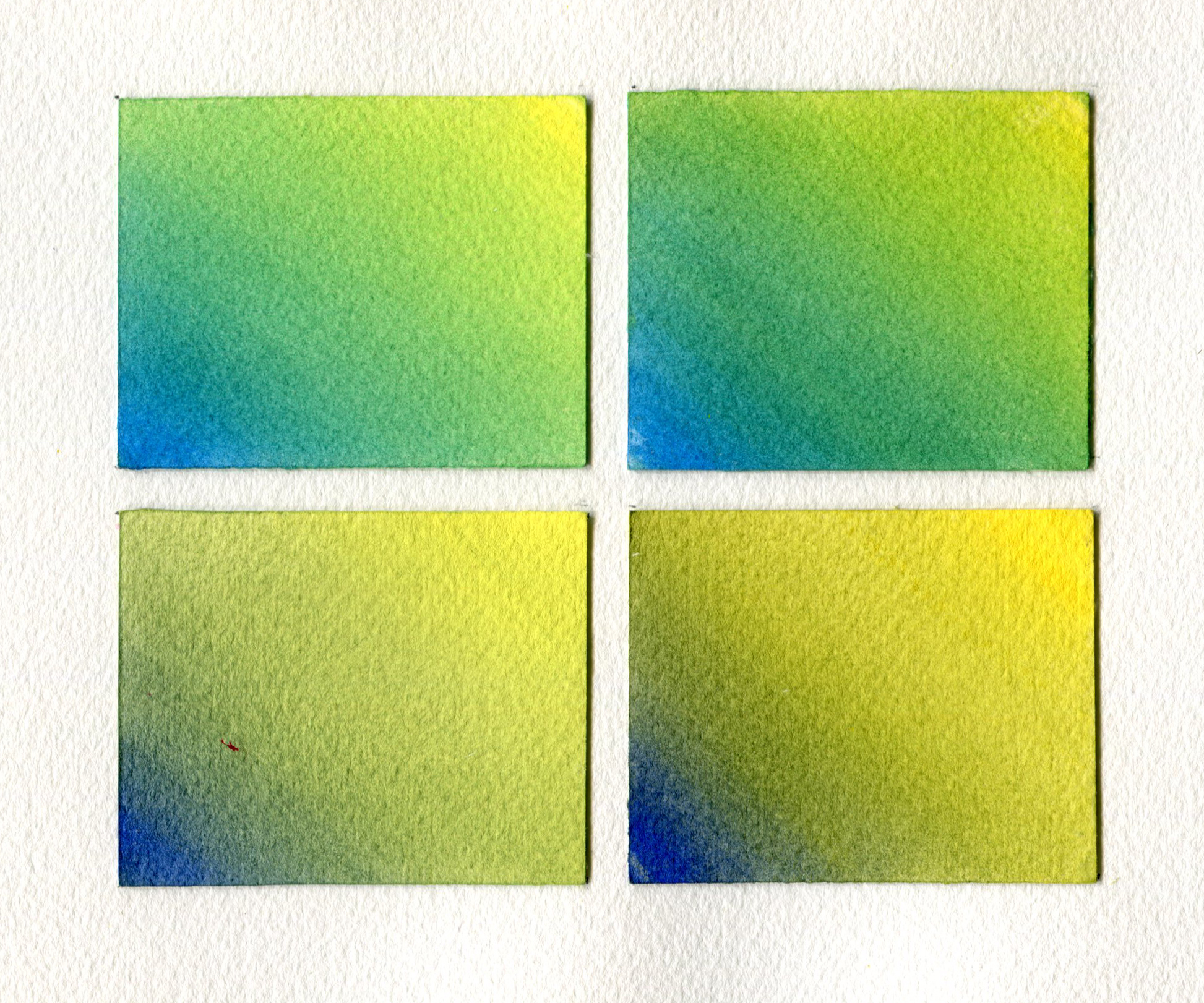
It is rare to find a pigment that creates a true ‘primary’ paint capable of clear mixes on both sides of the color wheel. A red that makes both vibrant purples and fiery oranges, for example, is hard to find. One way to compensate for this is to have two paints for each primary color: a blue that leans toward violet to mix violets, and a second blue that leans toward green to mix greens. How do you determine if a color is predisposed toward one or the other side of the color wheel? Through mixing tests. Using a green-biased blue with a green-biased yellow will result in a more vibrant green. A less saturated and more muted green would be the result should an artist use a violet-biased blue and/or an orange-biased yellow (see Image 1). These muted blends are quite lovely, and can really make a painting sing. However, the color might also devolve into mud when the artist is not paying attention to how the mix is used.
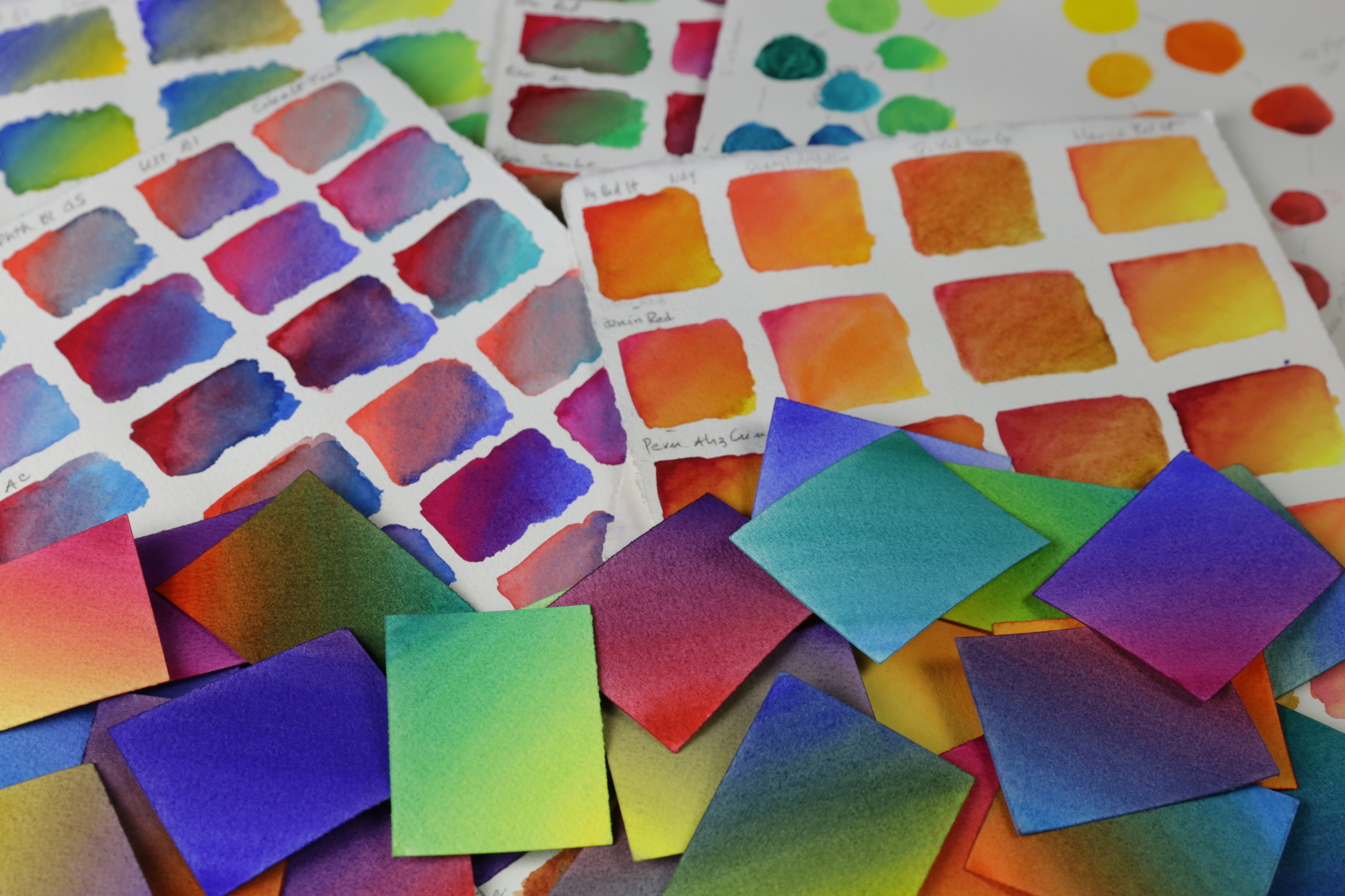
Initially we desired two saturated paints for each primary color (red, blue, yellow). This would give us six paints that would combine to create strong secondary (violet, green, orange) and intermediary colors (yellow-orange, red-orange, yellow-green, blue-green, red-violet, blue-violet). The QoR watercolor line has many vibrant colors, so mixing tests helped guide our selections (see Image 2). We also needed at least one pair of paints on the color wheel to mix a chromatic black.
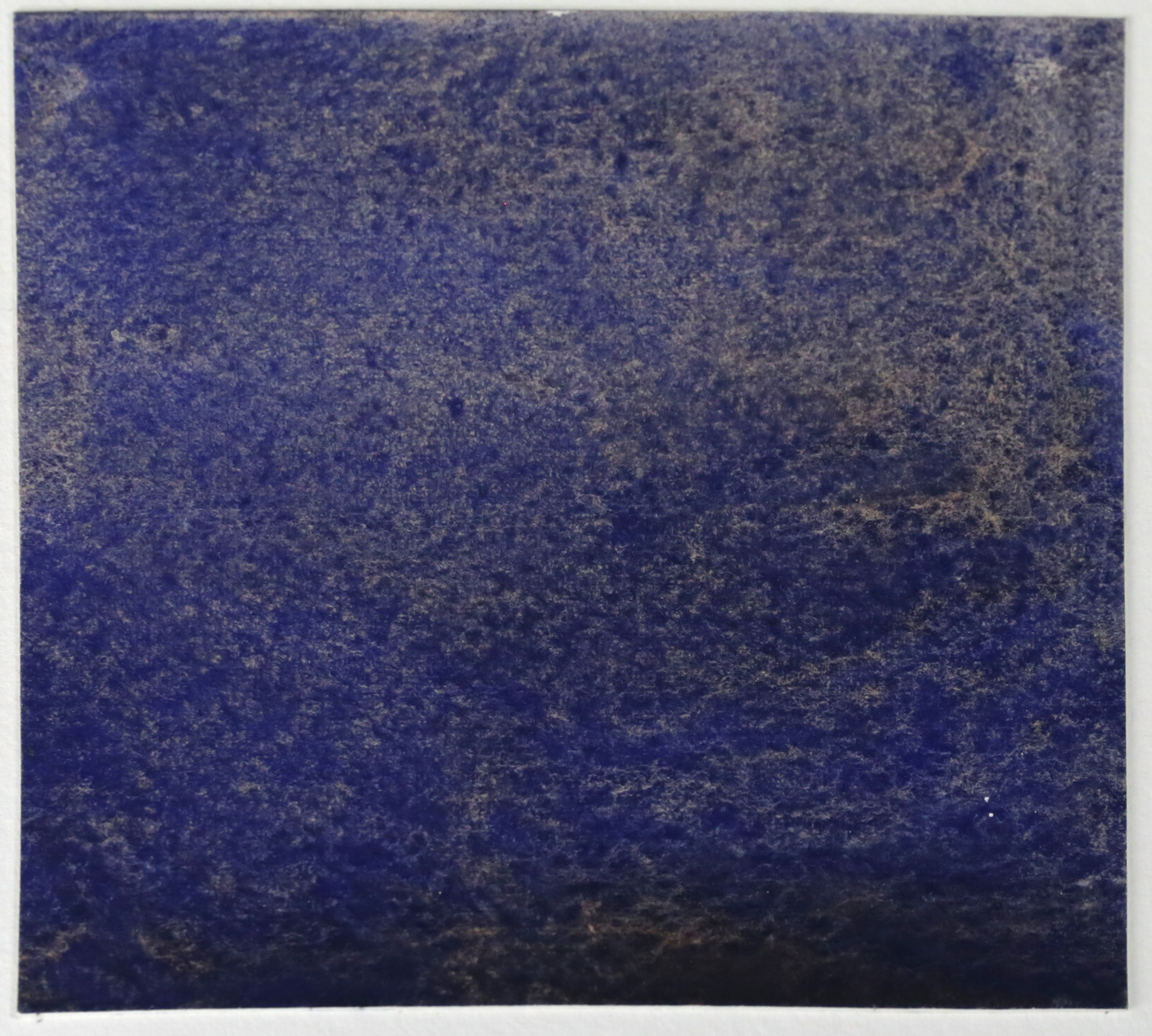
Once we selected finalists for the primaries, we found that our mixing tests were not providing a satisfactory black. We knew from previous experience that QoR Ultramarine Blue and Transparent Pyrrole Orange create a beautiful chromatic black that granulates (from the blue) and separates in interesting ways while drying (see Image 3). If we removed the orange-biased red in favor of QoR Transparent Pyrrole Orange, would the orange mix with Quinacridone Magenta to create a vibrant orange-biased red mixture? We found that it did. We made the switch, and had our palette of colors!
A Six Paint Color Wheel
Our color wheel is built from six paints: two blues, two yellows, a violet-friendly red, and an orange
The two yellows:
- Yellow for greens: Cadmium Yellow Primrose (PY35, ASTM LF-1, semi-transparent, non-granulating, staining)
- Yellow for oranges: Cadmium Yellow Medium (PY35, ASTM LF-1, semi-transparent, non-granulating, staining)
The two reds (and an orange):
- Red for violets: Quinacridone Magenta (PR122, LF-NA although our tests show LF-excellent, [i] transparent, non-granulating, staining)
- Orange-leaning Mixed Primary Red: mixture of Transparent Pyrrole Orange and Quinacridone Magenta
- Orange: Transparent Pyrrole Orange (PO71, LF-Good based on our tests, transparent, non-granulating, staining)
The two blues:
- Blue for violets: Ultramarine Blue (PB29, ASTM LF-1, semi-transparent, granulating, semi-staining)
- Blue for greens: Manganese Blue (mixed hue, PG7 and PB15:3, ASTM LF-2, transparent, granulating, non-staining)
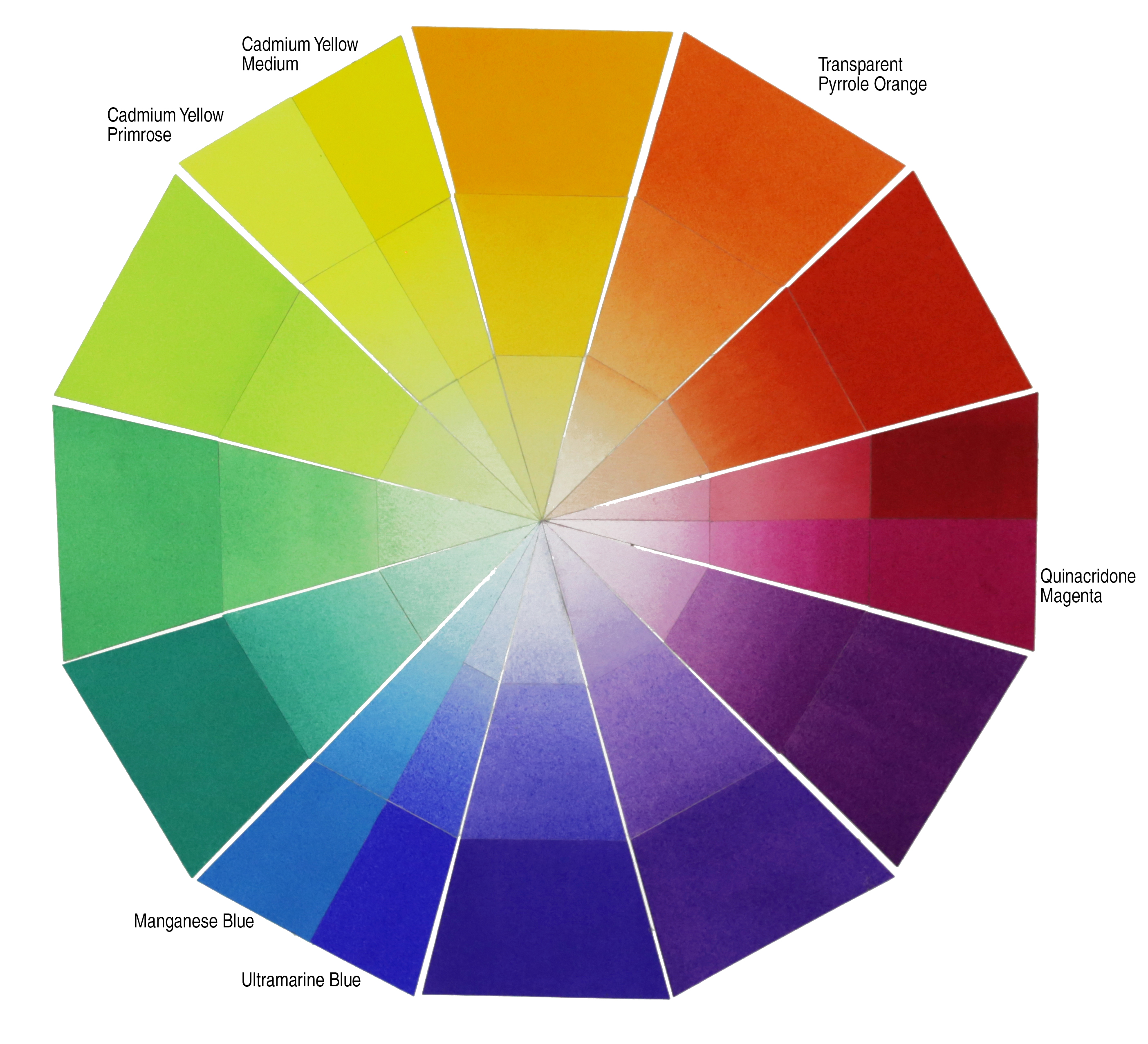
Since pigments have different mixing strengths, combining equal amounts of two primaries might create an intermediary rather than a secondary when one of the paints overpowers the other. It is important to use your judgement as you mix. To create violet, we mixed violet-friendly Ultramarine Blue and Quinacridone Magenta until the mix seemed to lean toward neither blue nor red. To create green, we mixed green-biased Cadmium Yellow Primrose and Manganese Blue until the green color appeared to visually balance between the primaries. Intermediary colors were then mixed to fill the step between each secondary and its primaries.
To create the color wheel itself, we brushed the paints and mixes out onto damp Arches Natural White 140 lb (300 gsm) Cold Pressed Watercolor Paper. Painting onto damp paper contributed to the velvety look of the most saturated washes. Once dry, the paper was cut to shape and adhered to a fresh sheet of watercolor paper using GOLDEN Heavy Gel (Matte). A board placed over the freshly glued collage flattened the papers as the gel dried.
Conclusion
The painters in the Materials and Application Specialist team of GOLDEN are paint geeks, and we love mixing color. We hope this color wheel will be both informative and inspirational. We encourage you to share our joy and mix some QoR paints of your own! What happens if you substitute other yellows for the Cadmiums in our palette? Which yellows mix more vibrant oranges? Which yellows are friendly to green? Take notes as you mix, and your explorations will be resources you can return to in the future. You might even take this one step further, and explore glazing two colors rather than physically mixing them. In watercolor, there can be a difference between the color created when physically mixing two paints together, and the color created when glazing washes of the paints over one another. Although this article focuses on the mixing, in a future endeavor we might see what happens with glazes rather than mixes. If we do, we will be sure to share. In the meantime, we wish you joyful watercolor mixing!
[i] Sarah Sands, “QoR Lightfast Testing Update,” October 21, 2015, accessed June 30, 2016, https://justpaint.org/qor-lightfastness-testing-update/

Subscribe
Subscribe to the newsletter today!
Thank you for this VERY helpful article. I’ve been trying to pare down my colors to make my palette more easily transportable and this will do the trick.
You are welcome, Ernie. Thank you for letting us know you found our article useful. Selecting a limited number of paints that mix a wide range of colors was one of our main goals when researching this palette. We are pleased with the brightness of the mixes these paints create, and hope you will be too!
Love this article as I, also, have been trying to pare down the number of colors I carry. Now, wish to know who might I ask about a similar short list for acrylics ? Thank you, Joanie
Hello Joan,
Thank you for your questions. The GOLDEN website and Just Paint newsletter both have a number of resources dedicated to color mixing, includng the “Modern Color Theory Mixing Guide” with ratios and drawdowns, and the “Classic Color Theory Mixing Guide” in the form of a painted color wheel. Patti Brady’s Just Paint article “Color Mixing . . . You can’t get it unless you do it!” also focuses on using a limited number of paints to mix a range of colors in acrylics. There are 8-paint sets of Heavy Body paints related to both the Modern and Classic Color Theory Mixing Guides. The Modern Set might be good place to start, as it contains two paints from each primary plus a green and a white: Hansa Yellow Light, Hansa Yellow Medium, Naphthol Red Light, Quinacridone Magenta, Anthraquinone Blue, Phthalo Blue (GS), Phthalo Green (BS), and Titanium White.
If you wish to use individual tubes or jars of Heavy Body paint, a palette that echoes the one in this article would be: Heavy Body CP Cadmium Yellow Primrose, or Bismuth Vanadate Yellow; CP Cadmium Yellow Medium, or Hansa Yellow Medium, or Cadmium Yellow Hue; Quinacridone Magenta; Transparent Pyrrole Orange, or Pyrrole Orange; Ultramarine Blue, or Anthraquinone Blue; Manganese Blue Hue, or Phthalo Blue Green Shade. A medium such as Acrylic Glazing Liquid could be used to create thin veils of transparent color, or Titanium White could be added to create tints and greater opacity.
I want to avoid cadmium in my palette and was very sad to see that was your recommendation. I get my paint everywhere and skin is absorbant so I am not comfortable with cadmium. I also see te cancer warnings on my beloved irridescents and manganese blue (plus others) I feel a little inconsistent drawing the line at cadmium and not excluding these others. That said, what 6 would you recommend for a happy colour wheel? I use acrylics more than water colours but imagine the pigments would behave similarly wether acrylic or water colour.
Hello Shelly,
This color wheel is only one palette option – there are numerous possibilities when selecting a range of colors with which to paint. Perhaps in the future we can research a QoR color wheel using other yellows. In the meantime, here are some possible QoR alternatives: Benzimidazolone Yellow (PY154) might work as a single paint primary yellow; Bismuth Vanadate Yellow (PY184) has a slight green bias; Hansa Yellow Light (PY3) leans toward green; and Diarylide Yellow (PY83) by itself is very close to a yellow-orange color space. Nickel Azo Yellow (PY150) leans slightly toward orange, provides an interesting color shift from mass tone to wash, and creates beautiful less saturated mixes.
We also spoke with Ben Gavett, our Director of Environmental Health & Safety, about your safety concerns with certain paint pigments. This is his response:
We hope this is helpful!
That is helpful. Thank you!
Thank you, the gazillion colors out there is overwhelming. Can’t wait to try these 🙂
Hello Karen,
QoR Modern Watercolors does have a lovely range of colors, and making a choice can be overwhelming. Given the range of possibilities, there are many options for palette choices. We hope you enjoy this selection!
great article. i am loving the qor watercolors for the vibrancy of color. still learning to use them as they stain more than WN paints did. the colors are unrivaled as far as i’m concerned tho. i fantasize about being one of the color testing team at golden!
Hello Lisa,
Thank you so much for the praise of QoR! We are pleased with the vibrant colors, too. Among the aspects that might impact how much a watercolor paint ‘stains’ a paper are the pigment concentration in the wash, the fineness of the pigment grind, and the pigment type. More pigment and a finer grind make it easier for the pigment to make its way into the paper’s fibers. As for pigment type, organic pigments (such as Phthalocyanine Blue GS/PB15:3 or Quinacridone Magenta/PR122) tend to stain more than inorganic pigments (such as Ultramarine Blue/PB29 or Burnt Sienna Natural/PBr7). There are always exceptions, though, like the inorganic Cadmiums, which can be hard to lift from the paper. And the paper itself might make a difference – whether it is hard sized or soft sized, for example. If you ever wish to make the possibility of working at GOLDEN real and not just a fantasy, we do post job openings on the Golden website. Occasionally there will be a job opening for a Materials Specialist. We are the people who answer artist’s questions, test products, and research for and then write articles like this one.
Great article, thanks for posting it! I, too, would love to see this with your acrylics.
Thank you! We agree that it would be interesting to see the same palette used for an acrylic color wheel, with translucent glazes rather than washes for the lighter areas. We hadn’t considered this comparison, and will keep it in mind for the future.
GOLDEN does have some resources on mixing acrylic paints. Patti Brady’s Just Paint article “Color Mixing . . . You can’t get it unless you do it!” contains mixing color wheels for a limited number of colors in acrylic. The GOLDEN website also offers acrylic color mixing resources, including the “Modern Color Theory Mixing Guide” with ratios and drawdowns, and the “Classic Color Theory Mixing Guide” in the form of a painted color wheel. Quin Magenta (PR122) is in the first two, Ultramarine Blue is in the third. These are the only colors also used in this QoR color wheel.
It would be great if a set of Just Six plus two was created – a compact, affordable way to try these 8 colors.
Thank you for the suggestion, what a lovely idea!
Are you gaining anything with two yellows and two blues over substituting one of each for a green and a purple? You’ve already exchanged a red for an orange.
Hello Hank,
It would certainly be possible to have a color palette of six paints that included three primary and three secondary watercolors. This article started with the idea of using a limited range of paints to create saturated mixes plus a chromatic black. Since red, yellow, and blue pigments often have a mixing bias—a red that mixes equally saturated oranges and purples is hard to find, for example—we embraced the dual primary approach in our search for color vibrancy. We broke from the primary pairs to switch out the orange-biased red for Transparent Pyrrole Orange so we had a more intense black mixture. Mixing tests with green or violet paints did not create more saturated intermediary colors than we already had, so we kept the two yellows and two blues.
Although not formally-trained, I am a paint nerd. As a teacher to older adults who want to learn to paint watercolors recreationally, I have been recommending the QOR Introductory 12 set because it has at least 2 different paints for each primary color. Please comment on the colors in this set when compared to the colors in this newsletter.
Hello Amy,
Thank you for your question, and for recommending QoR to your students! This article had a restrictive focus upon selecting only six paints that allowed for great color saturation in mixes. To this end, we eliminated many color options whose combinations create gorgeous and useful mixtures. The QoR Introductory 12 Set provides two options for each primary, as well as other colors that together offer a wide range of mixing options. If convenience and broad mixing potential are important, then the QoR 12 Set is a great option.
There are as many palette choices in watercolor as there are artists who paint with watercolor, and individual artists might make different palette selections based upon the subject being painted or their own personal preferences. Some artists might avoid Cadmium, or prefer watercolors whose pigments are intrinsically transparent. Other painters might change their palette depending upon the subject being painted, as I often do. There would be no need to shift away from the QoR Introductory 12 Set unless you and your students feel that another option would better fit the needs of those creating the paintings.
Hi,
Just started watercolor class after having begun acrylics about 18 mos ago, and just found and read this interesting post. I too am very concerned about toxic pigments–and not simply personally, but environmentally (dumping such toxins into our water systems IS an issue). So I tried to find a minimum set of watercolor primaries (warm and cool) that are least toxic and still do the work. Here is what I chose:
ultramarine blue, prussian blue, bismuth yellow, new gamboge, red vermillion, quin red,
raw umber
While I’m not completely happy with these, I’m still getting used to mixing them. Can anyone suggest better alternatives–or a minimum number of additions to round out my palette?
Many thanks!!
Hello Bobbi,
When selecting paints for a watercolor painting palette, artists have numerous choices. This article provides one option focused on vibrant color mixes. However, there is no reason the yellows could not be replaced with non-cadmium paints! Here are some possible QoR alternatives to the Cadmium Yellows on the “Just Six…” color wheel: for a single paint primary yellow, Benzimidazolone Yellow (PY154) deserves consideration. For a palette with two yellows, Diarylide Yellow (PY83) occupies a yellow-orange color space, and both Bismuth Vanadate Yellow (PY184) and Hansa Yellow Light (PY3) lean toward green. QoR Nickel Azo Yellow is also a gorgeous transparent color (and one of my own favorites).
Although it uses acrylic for the mixes, you might find Patti Brady’s Just Paint article “Color Mixing . . . You can’t get it unless you do it!” helpful. She also uses a limited number of paints to mix a range of colors. If watercolor paints containing the same pigments are used, similar mixes may be obtained.
I neglected to say that I am using oil colour and alkyd medium, not watercolour!
Hello Tim,
We are pleased you found the article interesting. And thank you for the link to your website, your paintings are lovely! We will combine our responses to your questions into a single post. If seeking colors similar to the printing cyan, magenta, and yellow triad in QoR, Benzi Yellow (PY154), Quin Magenta (PR122), and Manganese Blue (PG7 + PG15:3) would be one approach. However, QoR Manganese is a mixed hue, so might not be an option in a single oil or alkyd paint. Phthalo Blue GS (PG15:3) would be an alternative expanding the depth of mixed darks available.
Deciding which secondary mix needs to be the most saturated could help narrow choices when limiting the palette to a single red, a single yellow, a single blue, and white. If muted greens suit the subject, then a warmer blue and / or yellow could be selected. If violets need to be vibrant, then a transparent single red that mixes saturated oranges might not be possible. QoR Quin Magenta (PR122) leans to blue more than Quin Red (PV19) does, while a semi-opaque Pyrrole Red Medium (PR254) or Light (PR255) might be better for oranges. In QoR Watercolor, Benzi Yellow (PY154) is a bright semitransparent yellow that comes close to a non-biased yellow. The transparent Nickel Azo Yellow (PY150) is a warm golden brownish yellow in mass tone, yet shifts to a bright cooler yellow in glazes. Cobalt Blue (PB28) comes very close to being a blue not leaning to green or violet, but it also is relatively light valued and will not mix intense darks. To complicate matters further, the color appearance of a pigment may vary depending upon the painting medium! See the Just Paint article “Pigment Volume Concentration and its Role in Color” for more information on this difference.
Happy painting,
Cathy
Why was a palette of six paints with hues close to each other in the “color wheel” chosen as opposed to, say, six paints with hues evenly spaced along that “wheel”? Is it to avoid green somehow? As I read in Bruce MacEvoy’s handprint.com (“modern color theory: concepts”, principle 26), a “split primary” palette, as this palette seems to be, is usually inferior to one with six saturated paints evenly spaced along the “color wheel” (including green, as one choice of such a palette).
Hello Peter,
Thank you for your question. This is just one option for a color wheel, and a palette with three primary and three secondary colors would certainly be a viable option. We began this article with the idea of using two of each primary color to overcome the color mixing bias often found in pigments, and then switched one of the reds with an orange to obtain a more intense chromatic black. Mixing tests with green or violet paints did not create more saturated intermediary colors than we already had, so we kept the two yellows and two blues. The Just Paint article “Defining Warm and Cool Colors: It’s All Relative” might be of interest, as it has two yellows, two reds, two blues, and two greens.
Happy painting,
Cathy
Golden acrylic colors has a primary yellow, primary magenta, and primary blue. The colors have been adjusted (equalized or optimized) with the addition of white. What is the ratio of white to primary pigments used? I ask so I can make my own primary mixes and also to extend the idea to other (non-primary) colors to make a custom palette of adjusted “equalized or optimized” colors.
Hello Jeffrey,
Thank you for your questions. Unfortunately, it is not as simple as it might seem. GOLDEN Acrylic Primary Red is a single pigment paint, Primary Blue is a mix of two pigments, and Primary Yellow is a mix of three pigments. What those pigments are is listed on the paint label and on our website. In addition, each pigment has its own tint strength, so pigment-to-pigment ratios will be different for each mix and for each pigment used. Give us a call at 607-847-6154 or 800-959-6543 and we will be happy to talk with you about color mixing, pigments, and paint.
Best Regards,
Cathy
I’ve been using QoR colours since I saw this article about 10 years ago. I have 83 colors and haven’t added the newer ones.
To simplify use, I have a jewelry display that spins and has pegboard holes to hang the tubes. Behind the tubes is a card that has a wash of the color and all the specs: transparency, granularity, etc. This is hard to explain without pictures.
I have several folding palettes that I use to group the colors:
– QoR double primary
– Quintalo (Quinacridone/Phthalo) *my favorite
– Earth
– High Chroma
– Original 24
– Zorn
– Flesh Tones (Mind of Watercolor)
– QoR Observations (Dr. Oto Kano)
I don’t have a Sargent palette – yet
I also have caterers’ melamine trays with lids (reused from work meetings). Originally for acrylic because I could peel off the paint if needed. The trays don’t stain, so they can be washed off: I do keep a big one with old paint just for playing around.
That sounds like a fabulous way to organize your paints! We also appreciate it greatly that you are so dedicated to using QoR. Thank you for sharing.
Warm Regards,
Cathy
I would love to hear more about the Quintalo palette. Which QoR paints are in it and do you use it for specific subjects? Sounds like it would be fantastically vibrant.